Summary
A responsive web redesign of non-profit STI testing facility Hey Denver, with a focus on inclusivity.
My Role
As a UX designer on a team of three, my responsibilities were defining objectives, research planning, information architecture & navigation, usability, accessibility, and inclusion.
Scope
Our team of three UX Design Students had 3 weeks to redesign Hey Denver's webpages and appointment scheduling system.
Problem
Members of the queer community struggle to get STI testing when they really need it due to complex social pressures, lack of trust in testing clinicians, and busy work and social schedules.
Their issues are exacerbated by the opaque appointment scheduling function of Hey Denver’s current website.

Methodology
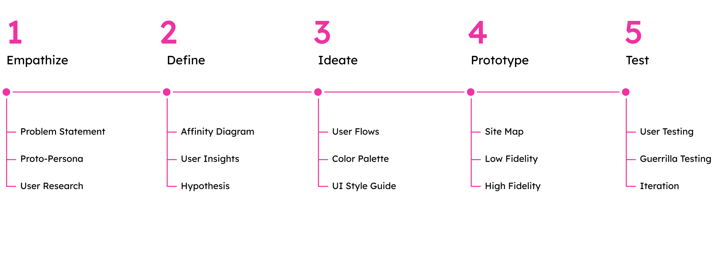
We began our work by defining the structure of our project, categorizing tasks into five design phases: empathize, define, ideate, prototype, and test.
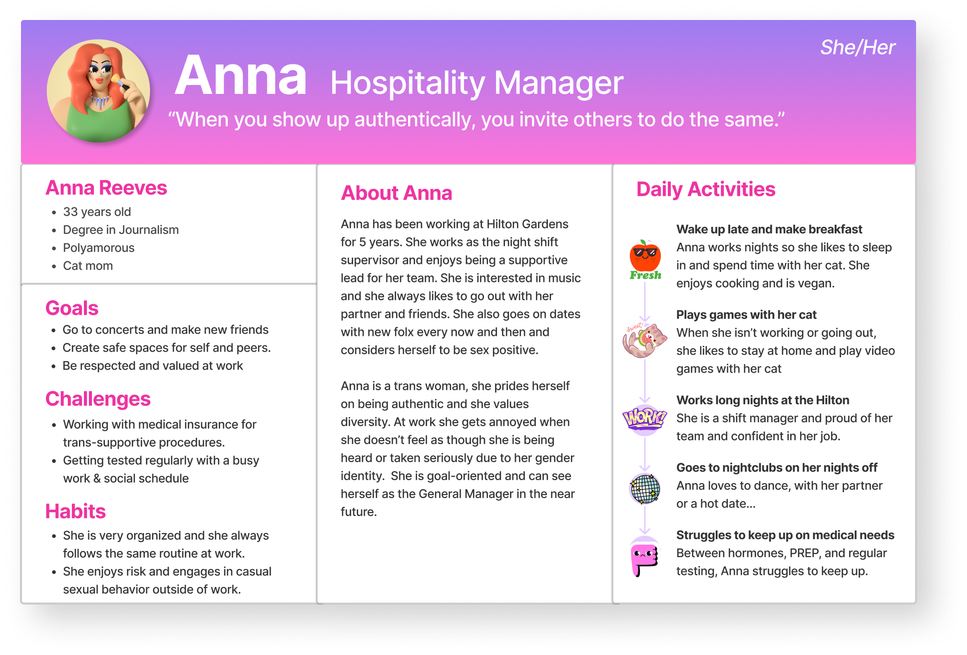
Meet Anna
Our primary goal was to solve the issues and challenges potential users might face when utilizing the Hey Denver website to book appointments for STI testing.
To do that we needed to empathize with and understand Hey Denver’s users.
User Research
We interviewed 8 users, focusing on people who identify as LGBT+ in order to adhere to the queer-centered mission of Hey Denver. We learned a lot from our interviews!
42% of users interviewed claimed no testing in the last year.


“I think that making sure that I'm not feeling judged or stigmatized is really important.”

Affinity Diagram
We analyzed our research data and mapped it to an affinity diagram, categorizing our user’s responses into actionable insights.
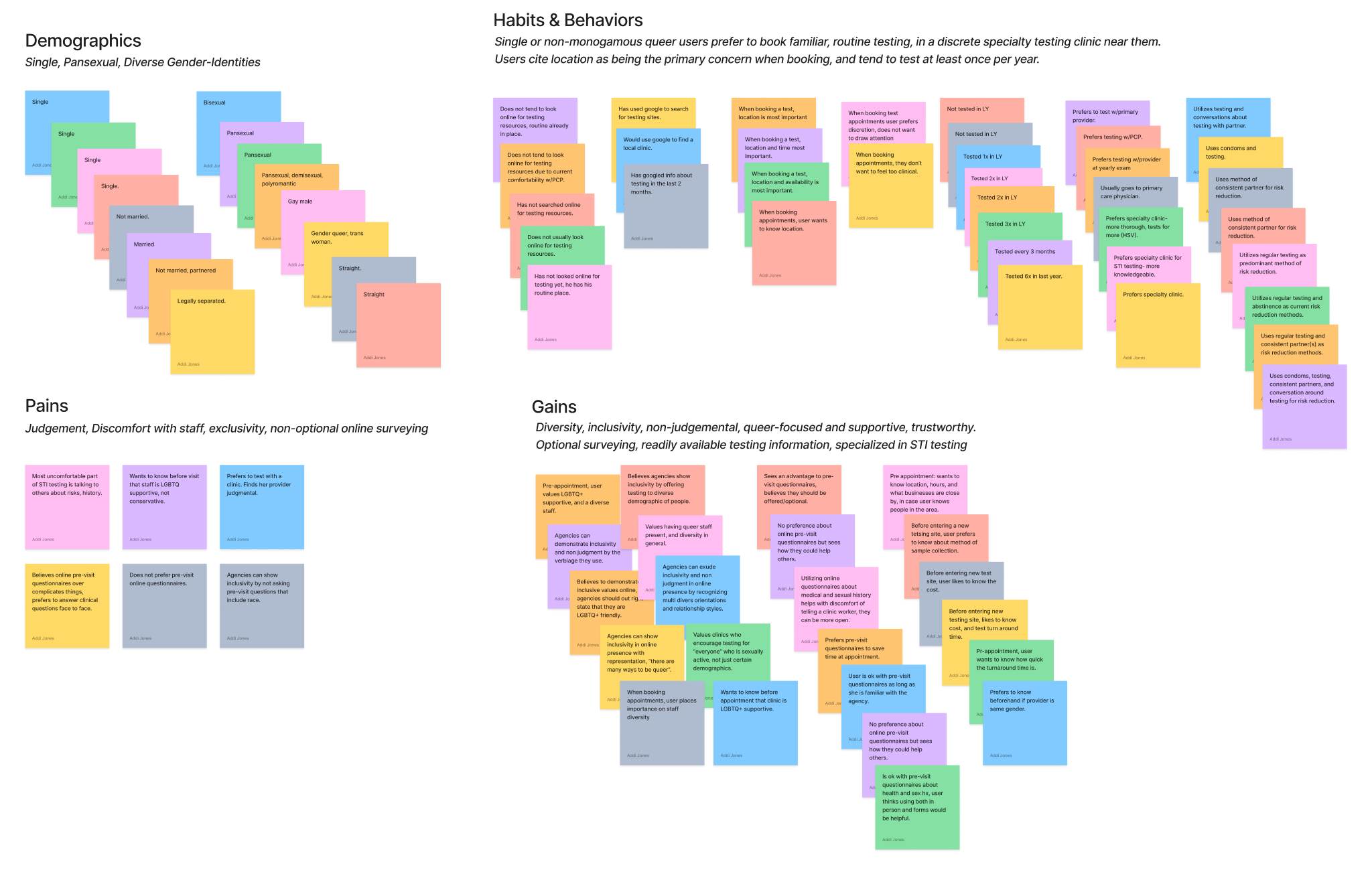

Hypothesis
Members of the queer community need a simple and non-judgemental way to book an STI test at a clinic that focuses on their community, makes them feel comfortable with their identity, and understands their unique needs.
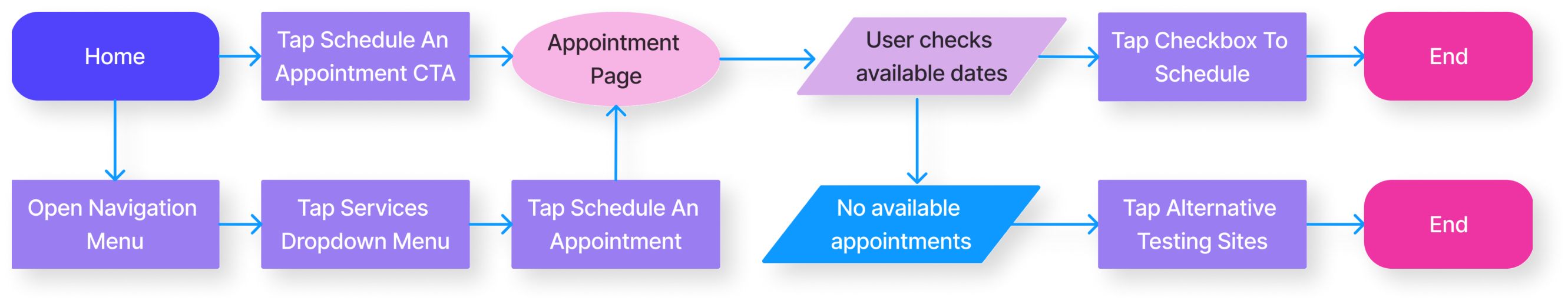
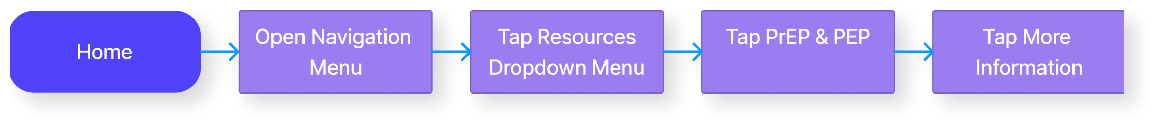
User Flows
Hey Denver’s website has so many incredibly useful resources, it’s a little overwhelming to find what you need. We wanted to redesign how you navigate the pages to reduce the mental load on our users. We started with a few ideal user flows.
Appointment Scheduling
PrEP & PEP
Inclusive Design
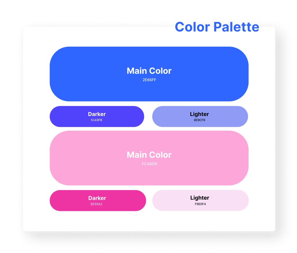
We obsessed over color style. We wanted to find the perfect combination of colors to properly express to the user:
“You are welcome & safe here.”
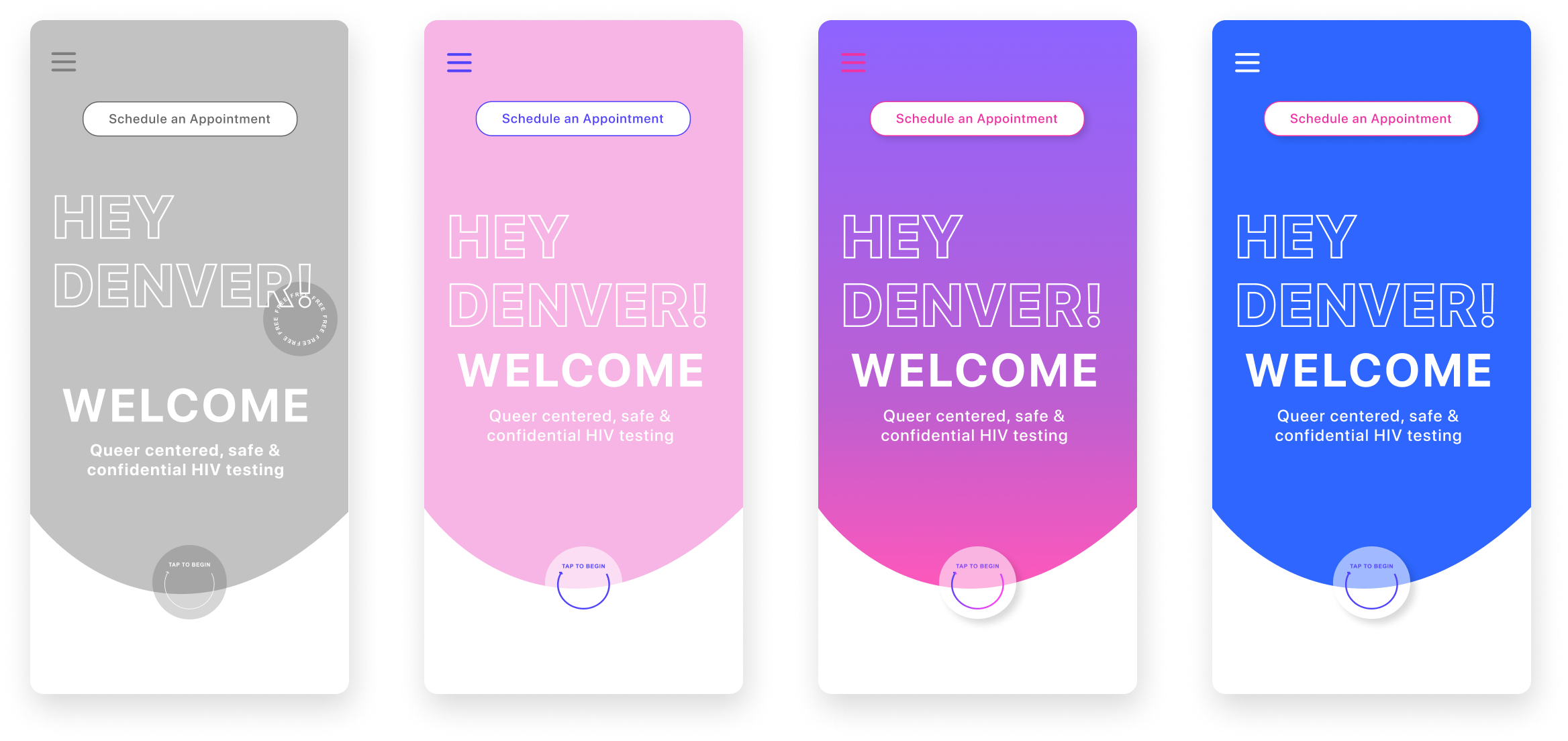
UI Style Guide
We settled on a color palette that felt representative of our primary user, without being too distracting and ensuring compliance to WCAG standards for contrast.

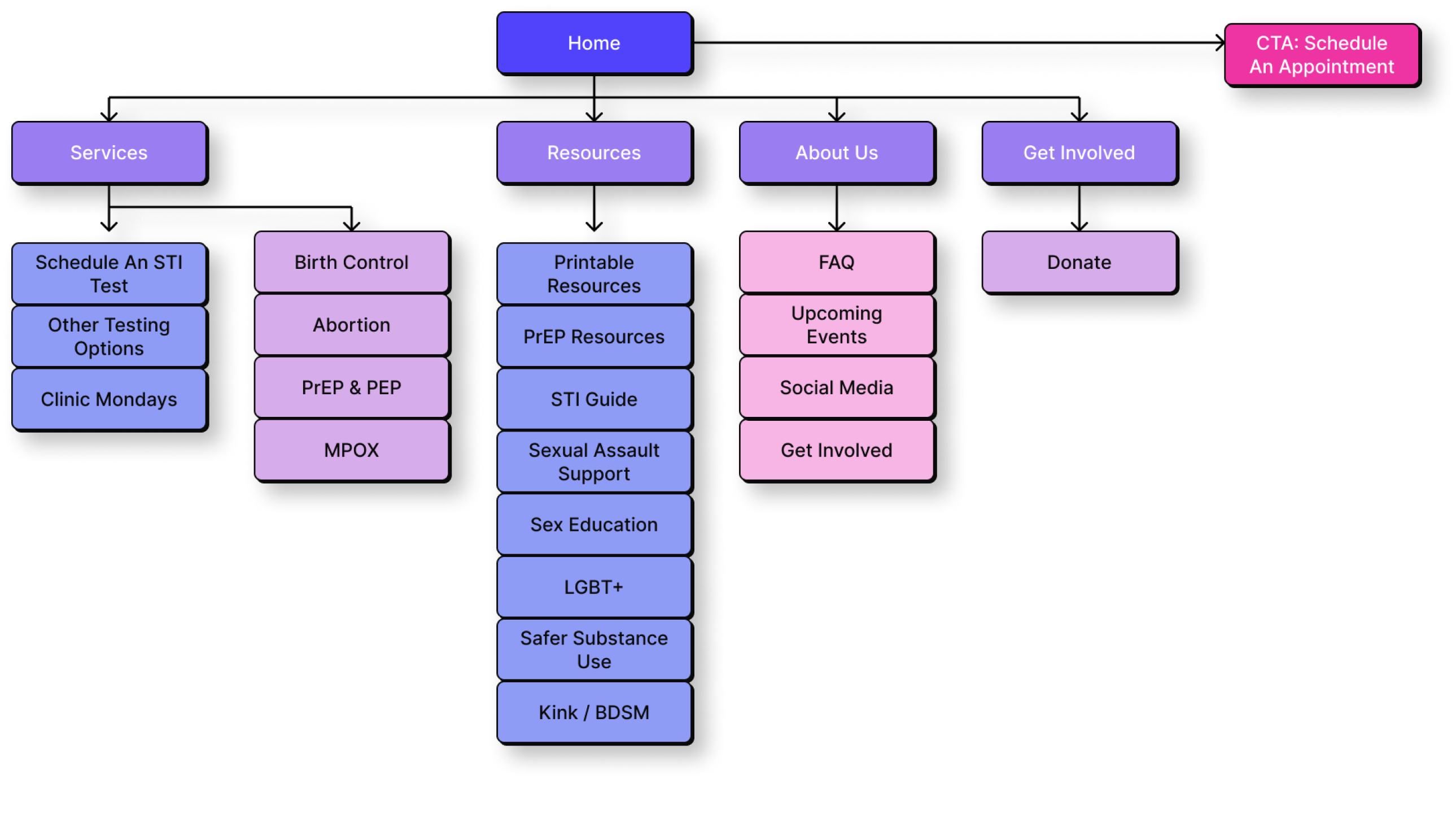
Sitemap
Prototype
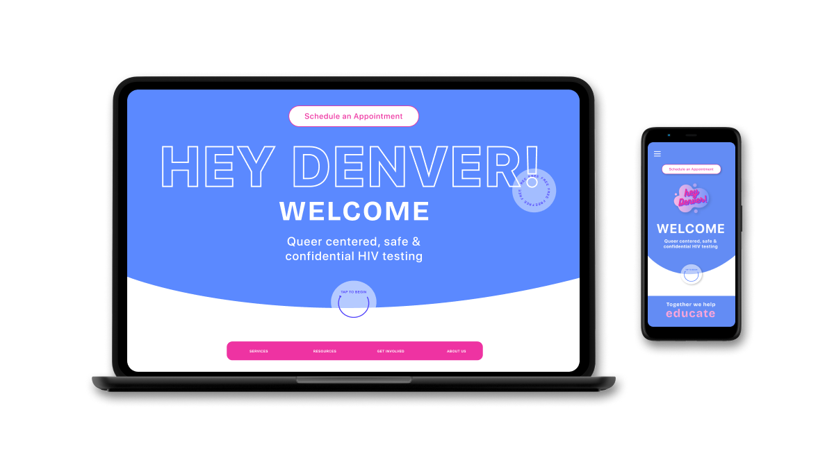
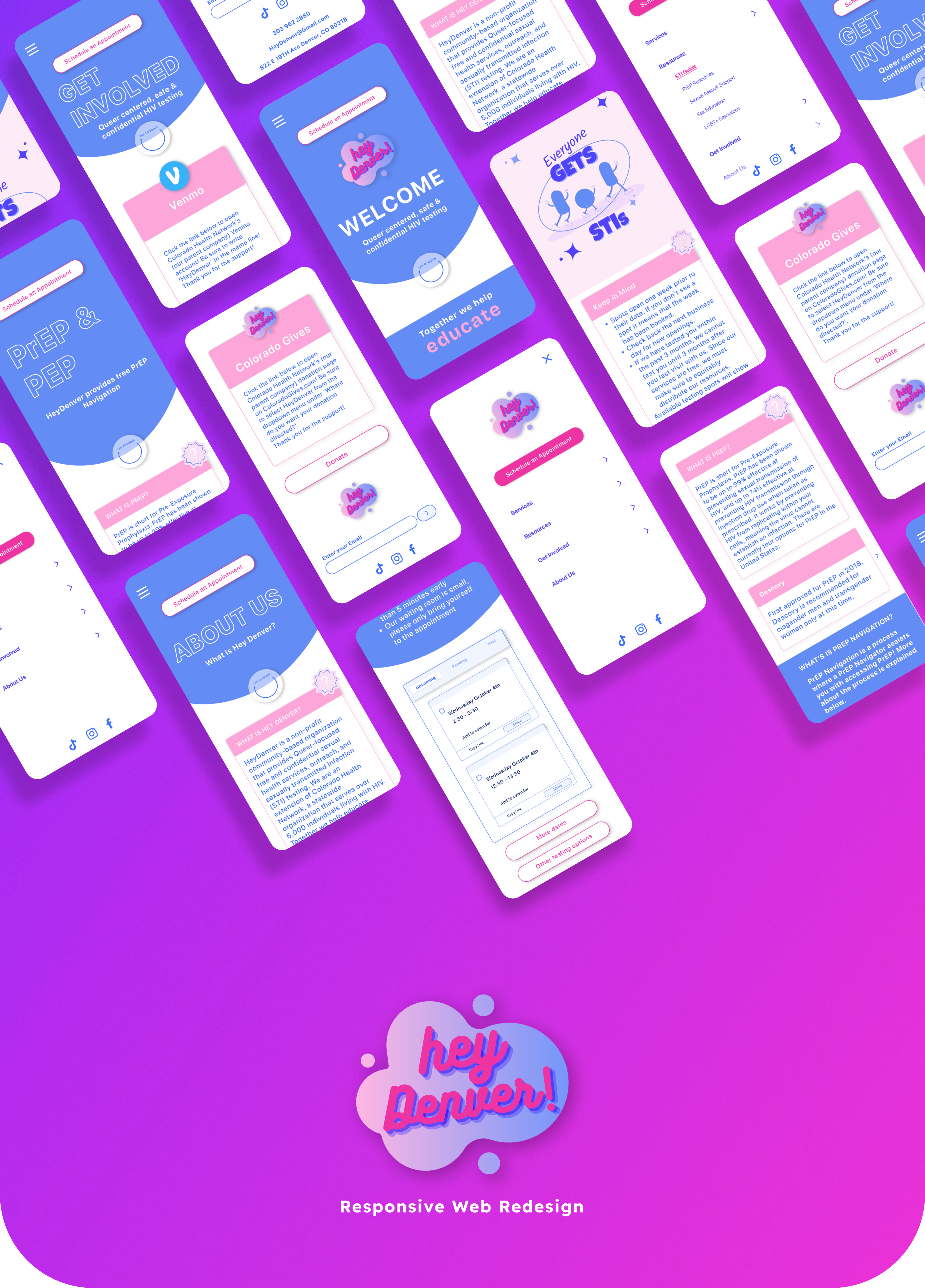
In the final mobile prototype for HeyDenver's website, we aimed to create a seamless and user-centric experience that aligns with the organization's mission of providing accessible sexual health services.
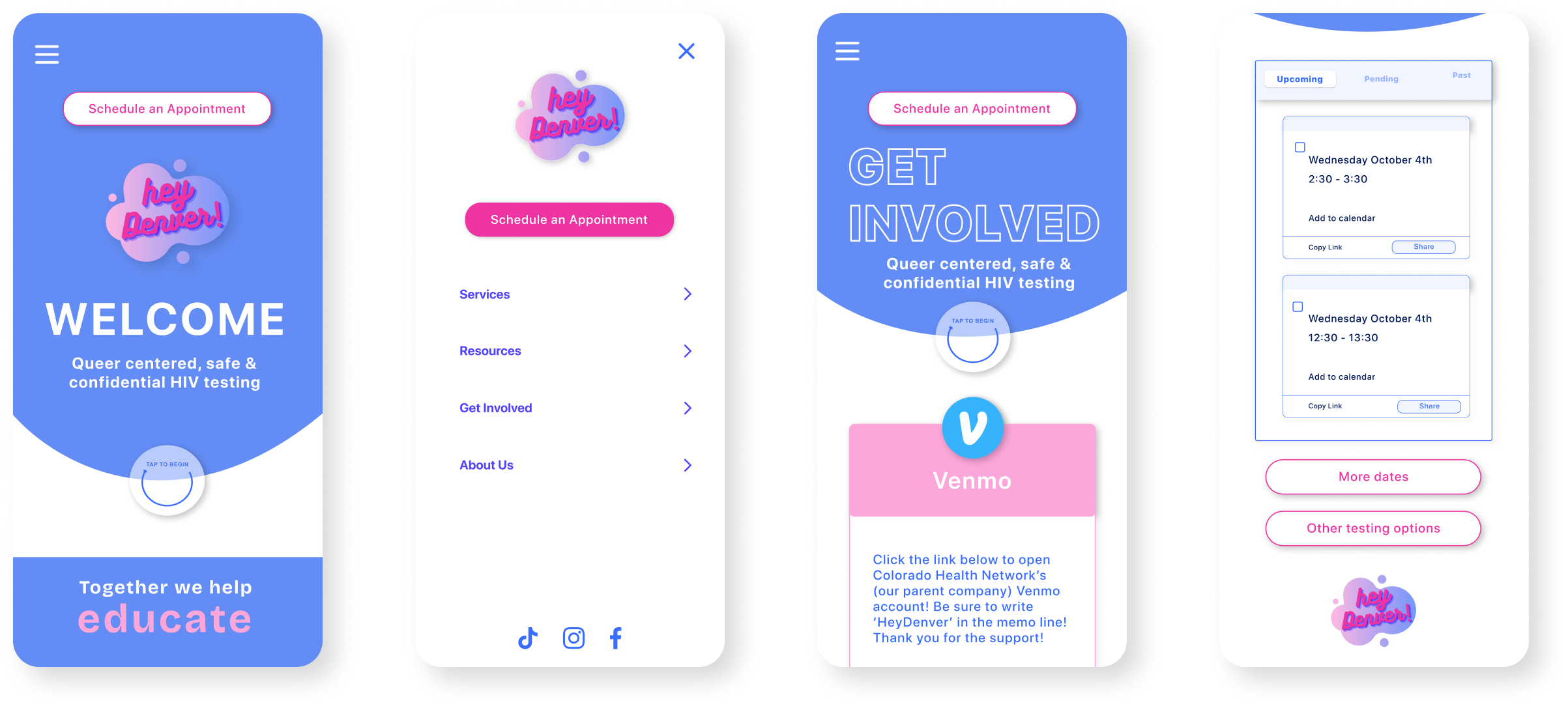
A welcoming home page that is simple to navigate and understand.
An organized and improved mobile navigation to get you where you need to be.
Help support, volunteer, or donate to Hey Denver on the improved "Get Involved" page.
Easy step-by-step appointment scheduling with the ability to view previous and upcoming appointments.

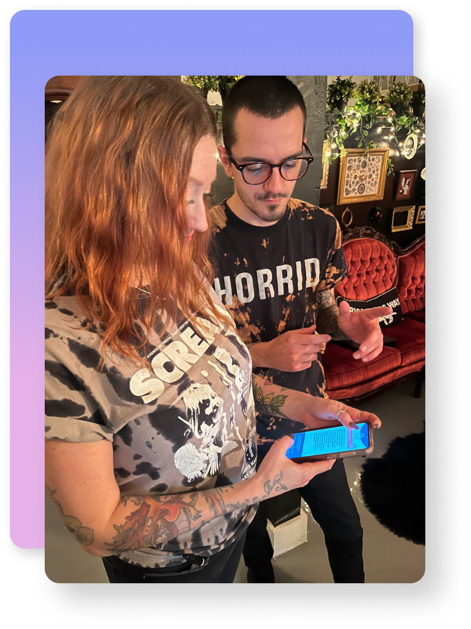
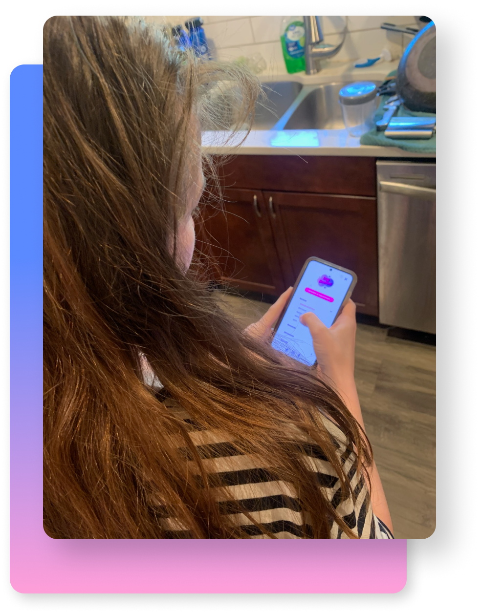
Usability Testing
We went out in the field (literally) to conduct usability testing on our prototype with 7 users, to see if our appointment scheduling system worked. We achieved a 100% success rate, but we still uncovered issues to solve!
"It feels very fun & friendly! I would go here!"
"I’m not sure if it confirmed my appointment..."
Future Opportunities & Next Steps
1.
Translate site to Spanish to accommodate more users.
2.
Continue to test and refine appointment scheduling to enhance user experience.
3.
Implement integration with digital calendars.
Thank you for checking out my case study!